Joshua Kranefeld
UI & UX Designer
In this blog you will find lots of useful tips, tricks and explanations that will help you become a better designer.
Discover more content
You want to try?
Save time?
You need help?
Bottom Navigation
You can edit 8 Components for free. Get premium for unlimited access.
The bottom navigation component offers global, persistent navigation throughout an app. The bar is always visible and within reach, making it easy and quick to move from one section to another with a single tap.
The design is derived from standard patterns on iOS and Android that our users are already familiar with.
Common Alternative names
Bottom tabs, bottom bar, tab bar
1. Anatomy
Bottom navigation can have up to 5 tabs with one active tab. You can optionally add a badge to one of the tabs.
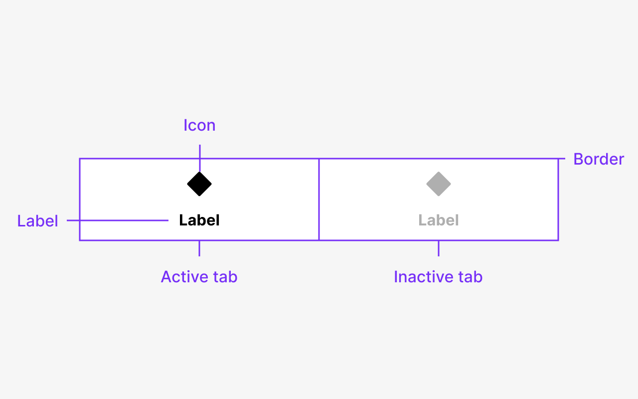
Image 1.1 : Label - Tab - Icon - Border
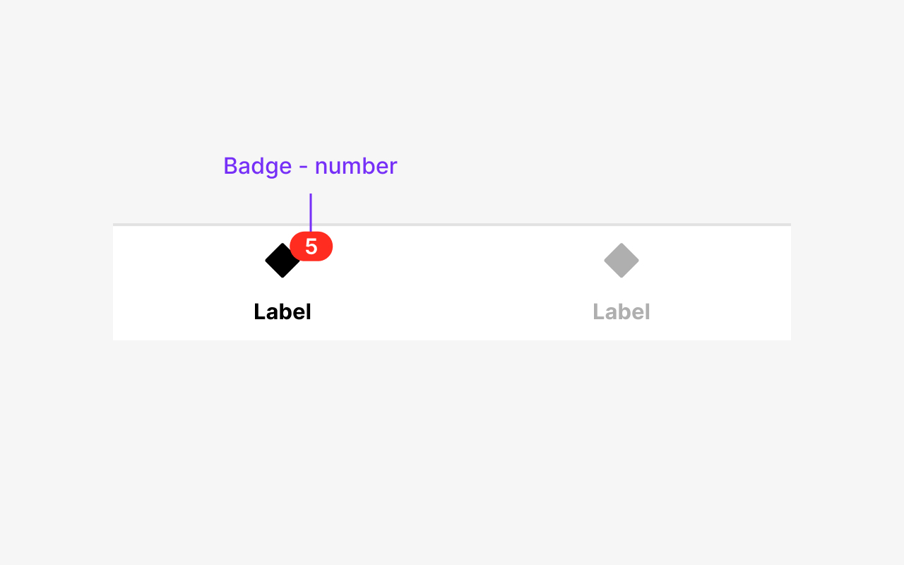
Image 1.2 : Badge - number
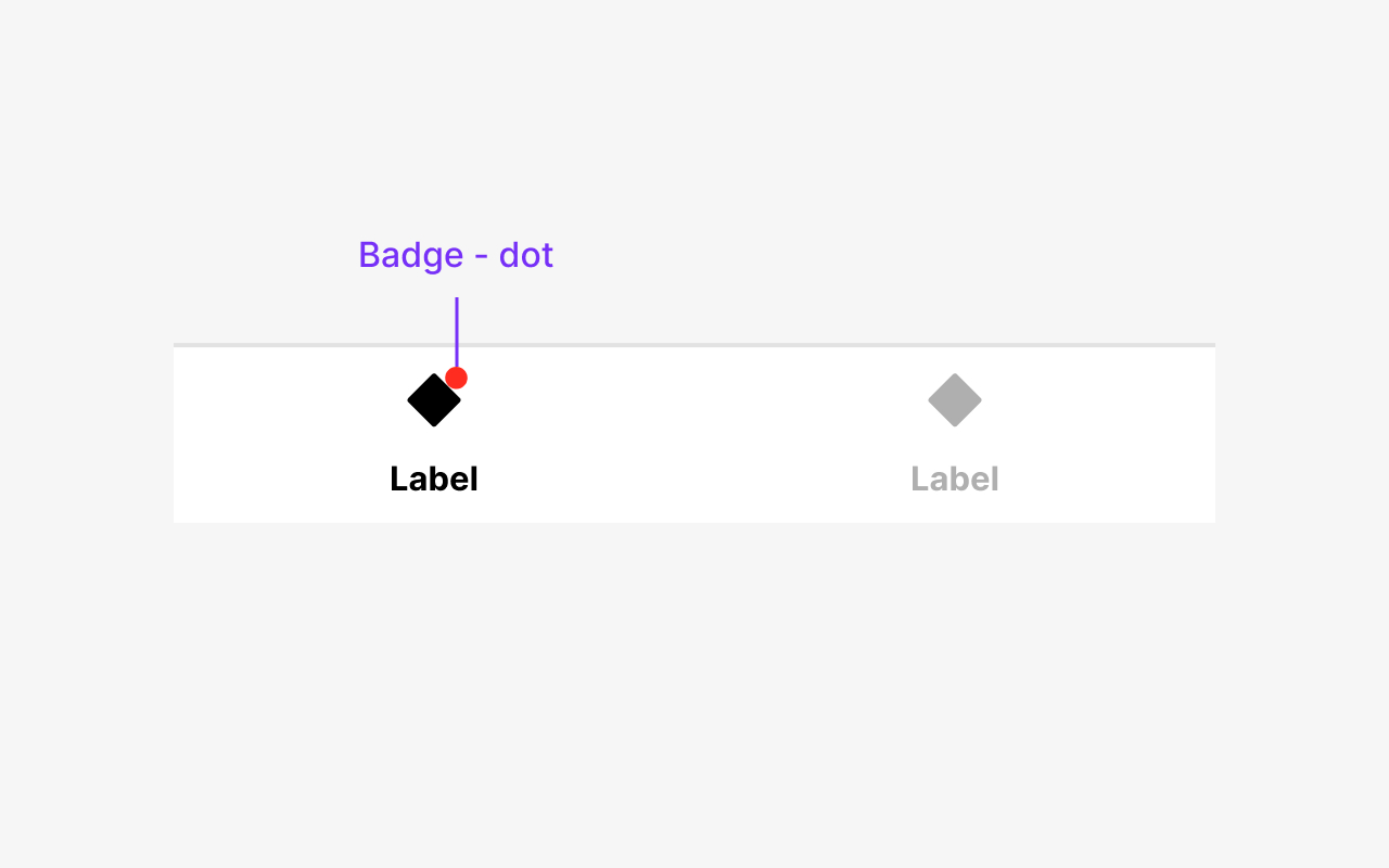
Image 1.3 : Badge - dot
2. Usage
Use bottom navigation when users need to quickly move between a small number of global, high-level categories. The bottom navigation contains 3 to 5 equally sized tabs used to switch to different sections of your app.
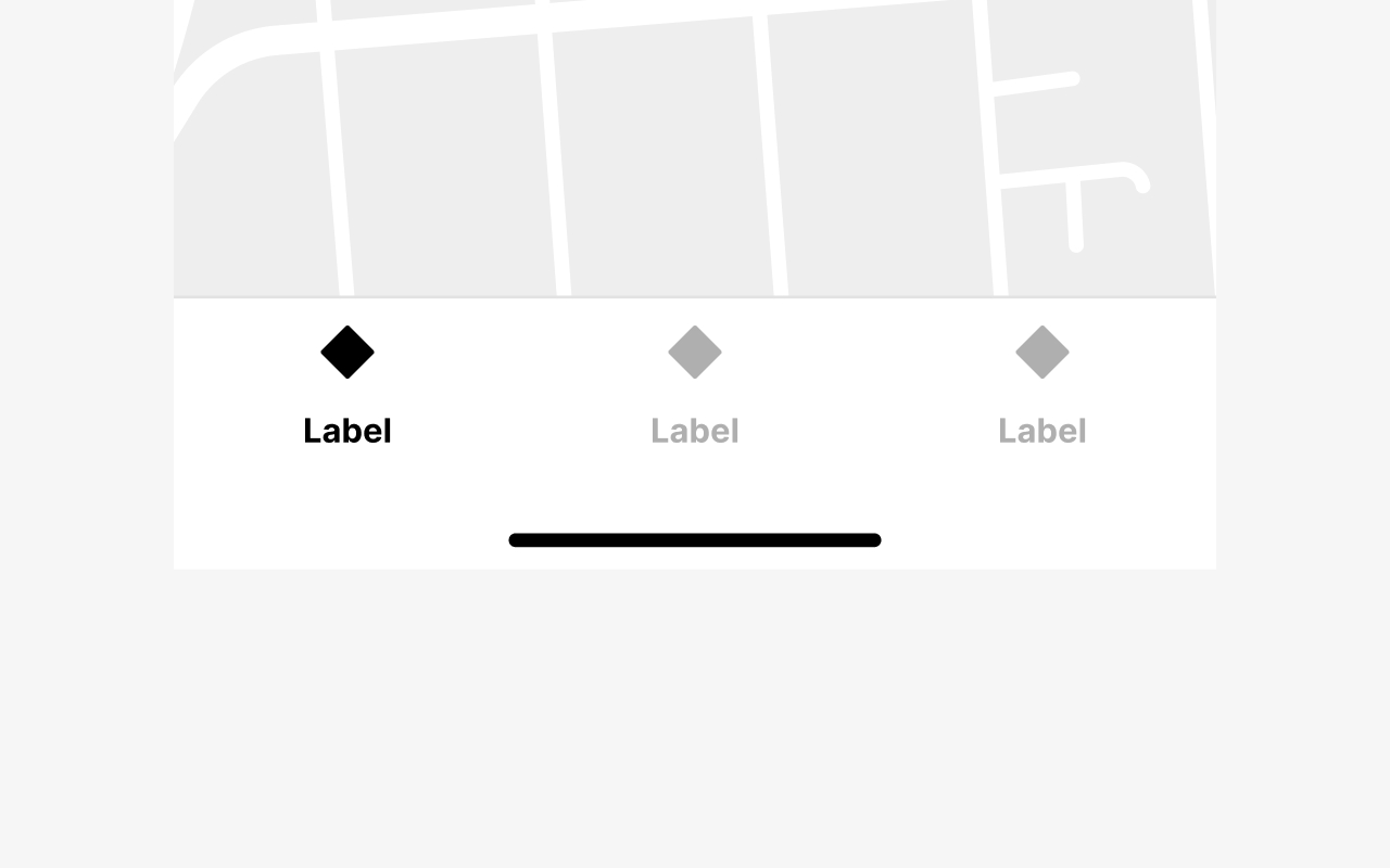
Image 2.1 : Minimum 3 tabs
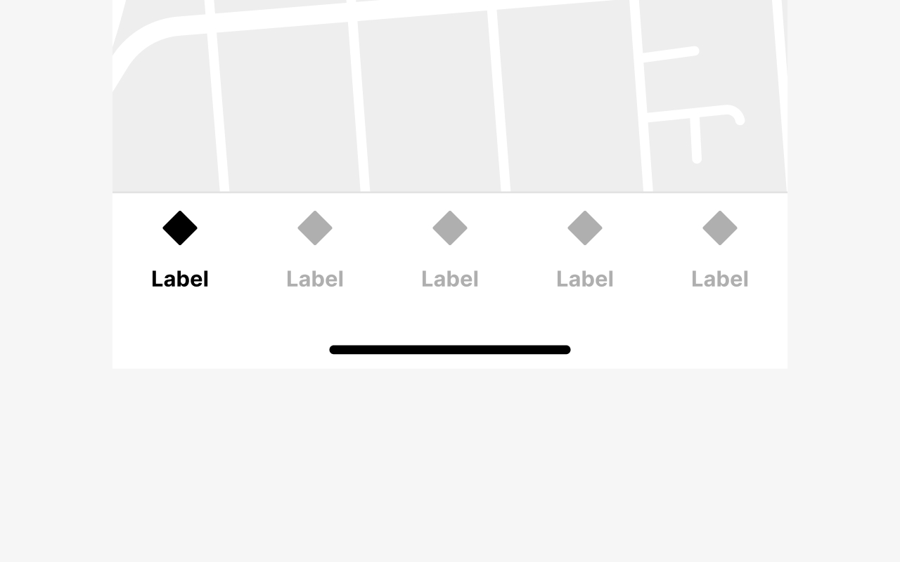
Image 2.2 : Maximal 5 tabs
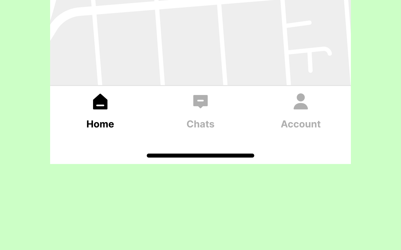
Image 2.3 : Independent sections
Use the bottom navigation switch between independent sections.
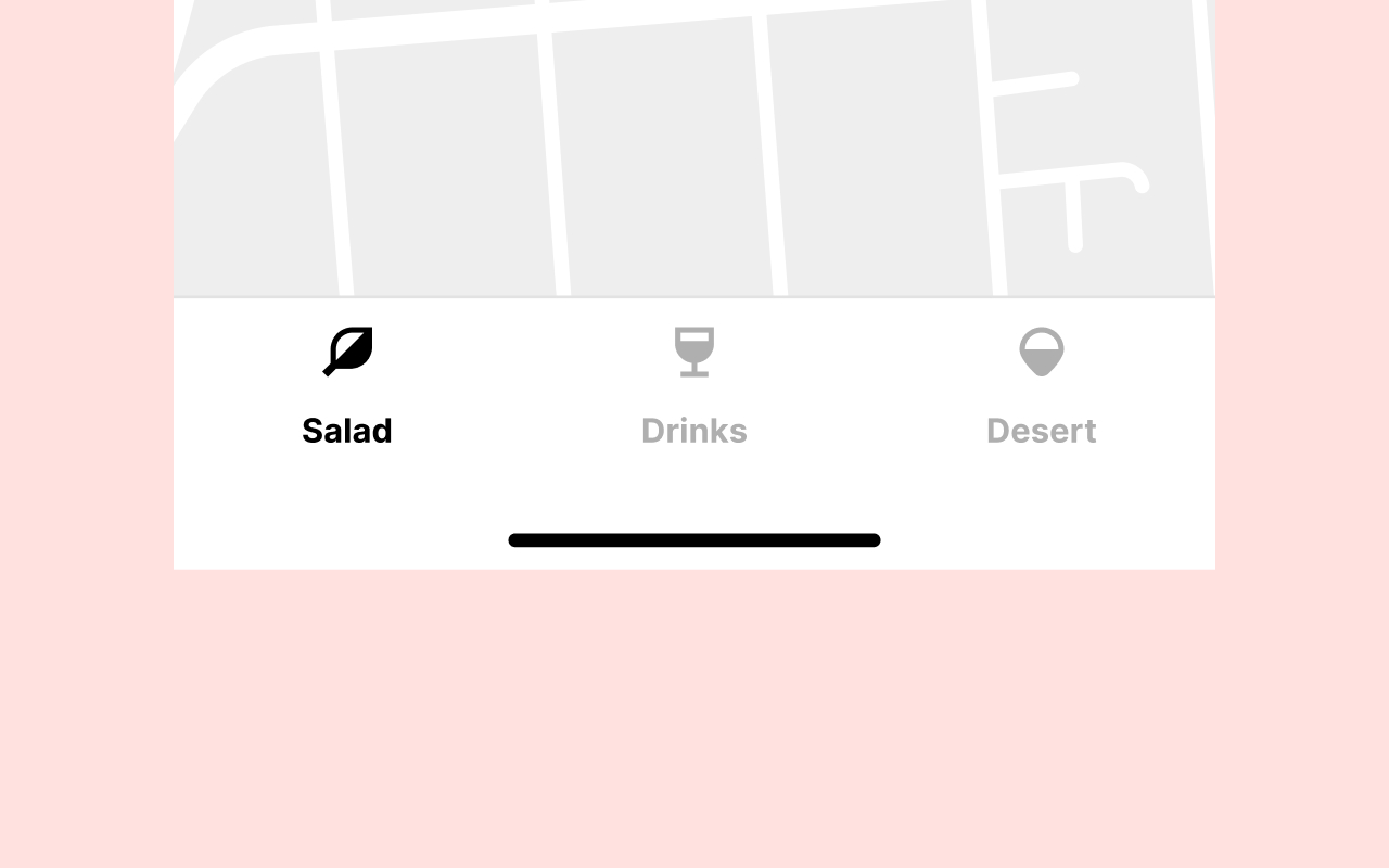
Image 2.4 : Split up content
Don’t use the bottom navigation to split up your content. Use the Tabs component instead.
3. Hierarchy
In most cases, the bottom navigation will be the top-level primary navigation unless the app has a hamburger side menu drawer, which will be the secondary navigation.
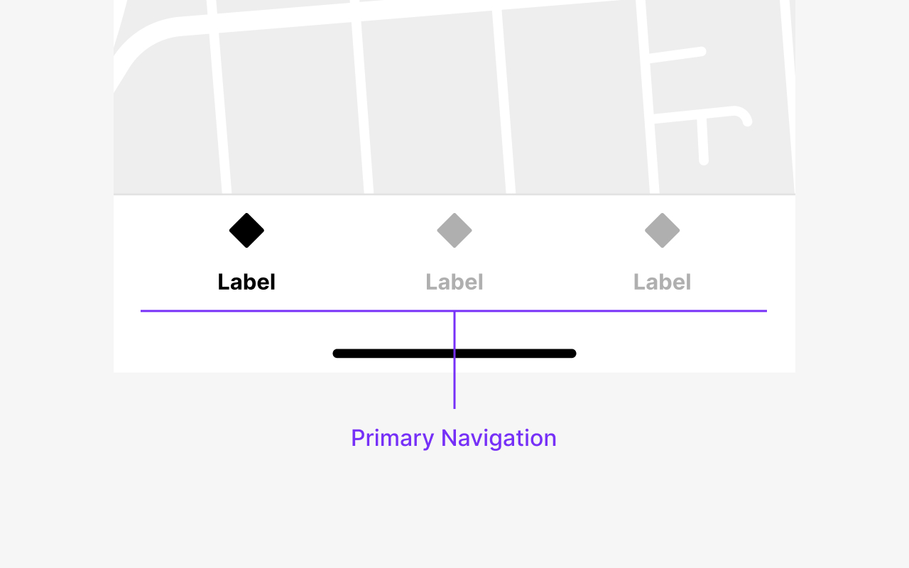
Image 3.1 : Primary Navigation
Primary Navigation
The bottom navigation is the primary navigation.
4. Behavior
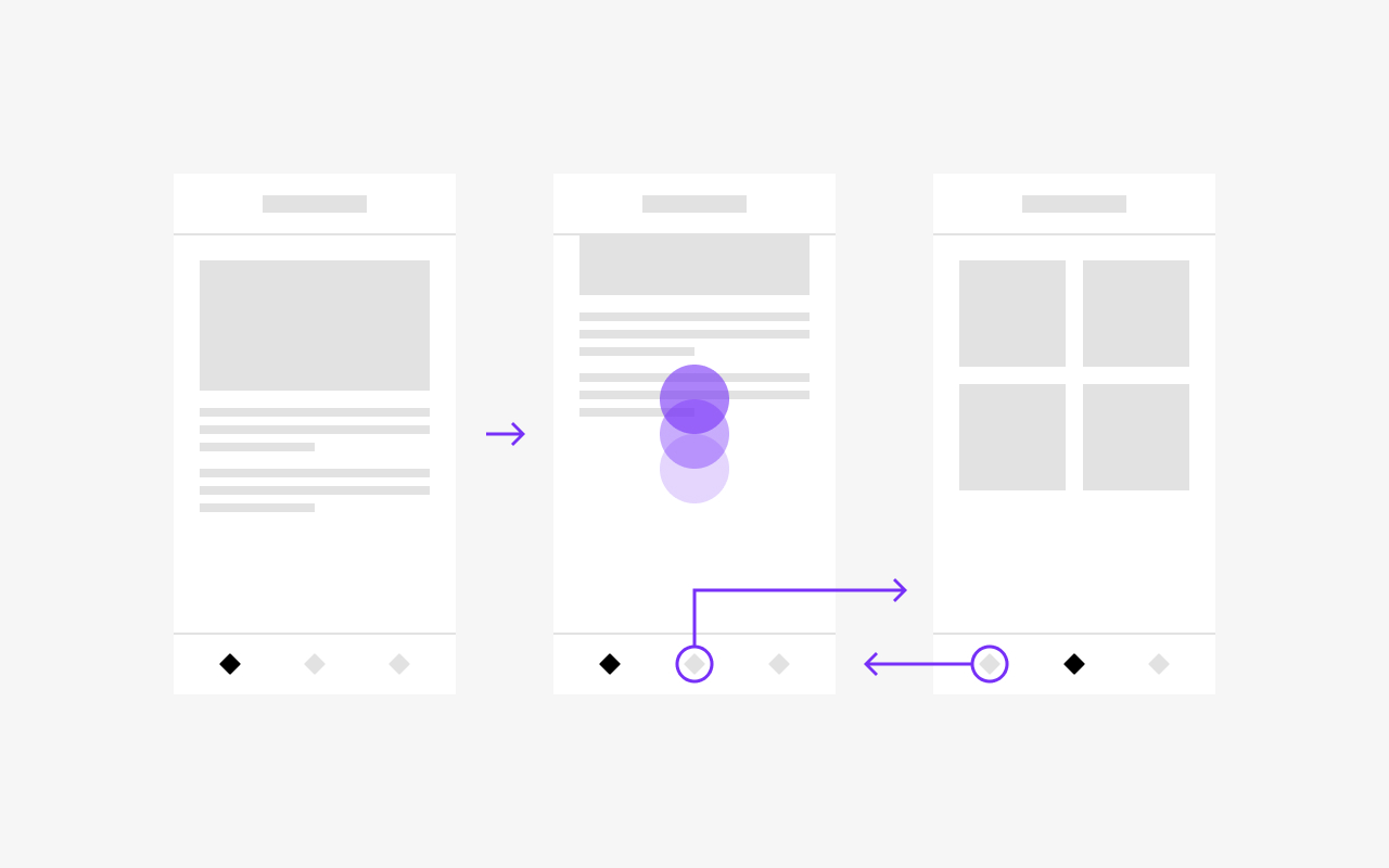
Bottom navigation tabs can have 2 states, active and inactive. Tapping on an inactive tab will make that tab active. Tapping on a tab that’s already active will scroll the content back to the top of the section.
As users navigate from one section to another, every prior interaction in one of the sections should be maintained, including the scroll position.
Image 4.1 : Behavior
The sections controlled by the Bottom Navigation are independent of each other, with content that is completely different and has its own navigation stack.
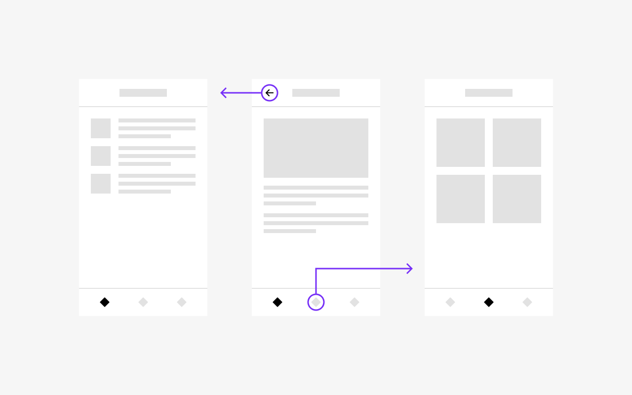
Image 4.2 : Behavior
Tapping an active tab will scroll the section's content back to the top.
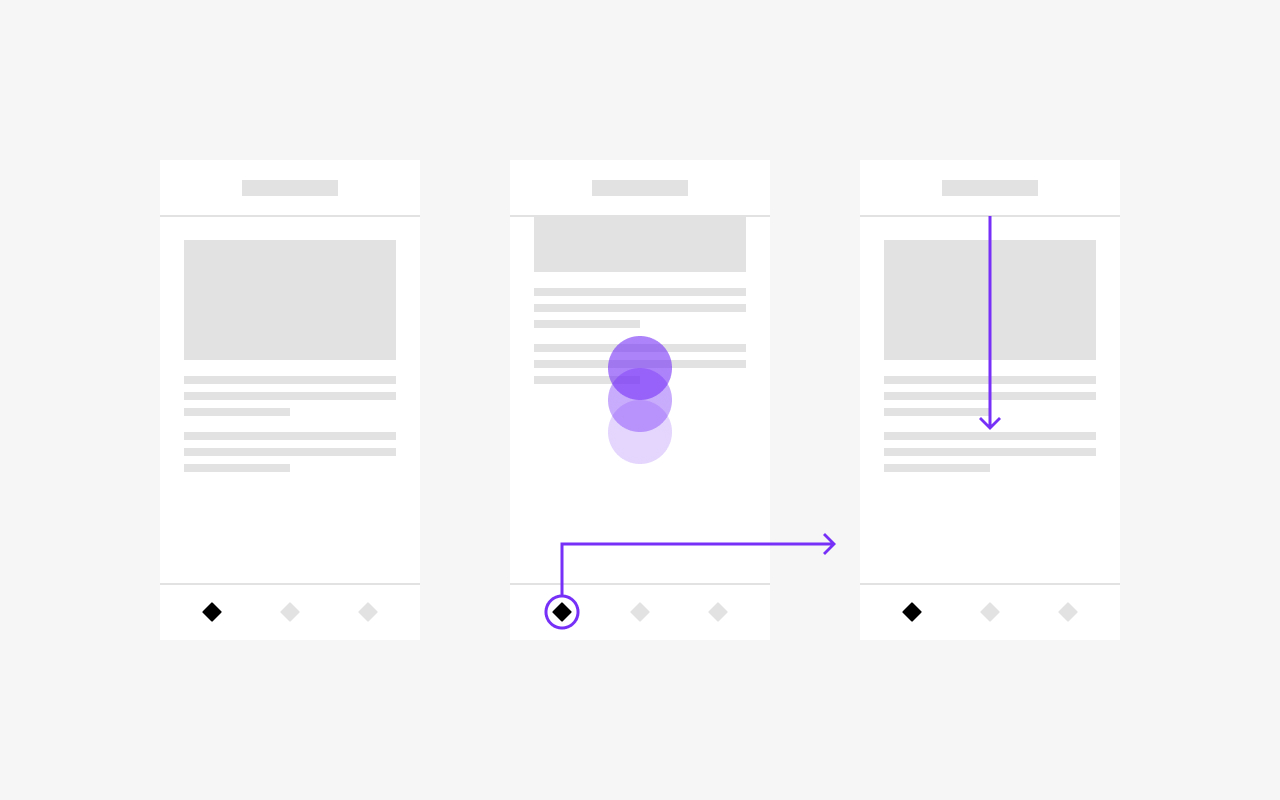
Image 4.3 : Behavior
5. Placement
Bottom Navigation is positioned fixed sticky at the bottom of the screen. All interactions of the section should happen within the section, and the bottom navigation should always remain visible, making it possible to switch to other tabs at any time.
Only components presented modally can go above the tab bar, focusing on these surfaces instead.
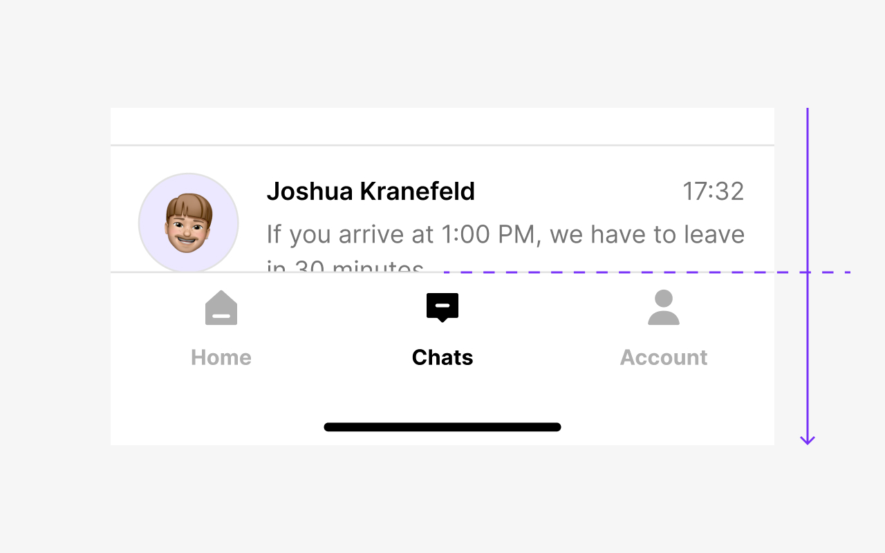
Image 5.1 : Always visible
Bottom navigation is always visible, and the content scrolls behind it.
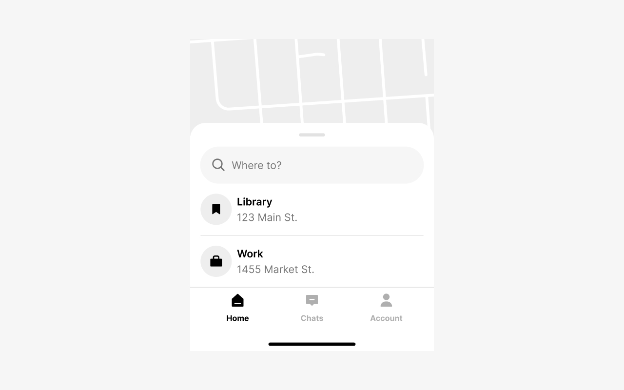
Image 5.2 : Not presented modally
A standard sheet (not presented modally) starts above the Bottom Navigation and doesn't overlap
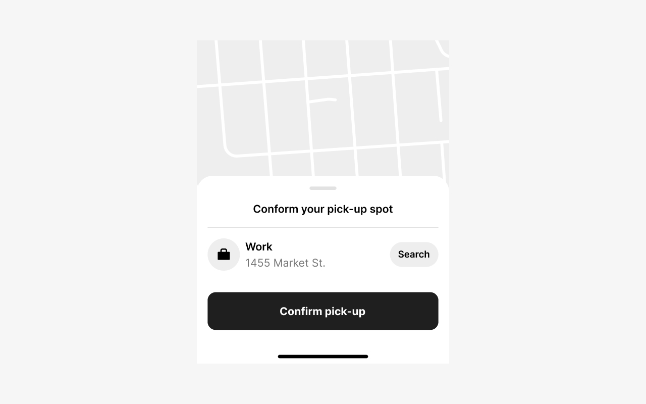
Image 5.3 : Modal overlap
Modals will overlap over the tab. Closing or dismissing it will return you to the active section.
6. Badging
Bottom navigation supports badges to indicate new information or a required action on a particular section.
When a user taps on a badged tab, it should be immediately obvious why it was badged and, in case of a required action, how to resolve it.
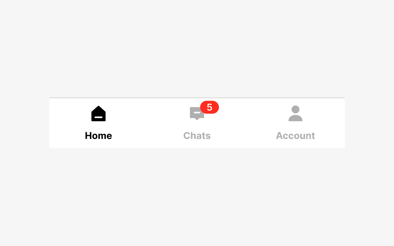
Image 6.1 : Numbered badge
A numbered badge can indicate the number of new items or pending actions in a section of the app.
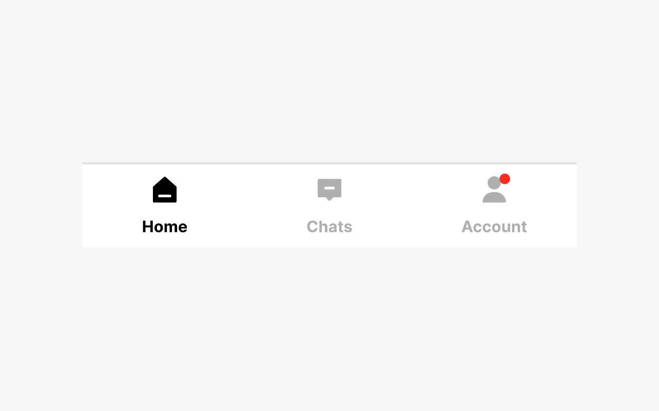
Image 6.2 : Small nudges
For smaller nudges, you can use the dot.
7. States
Bottom navigation can have up to 5 tabs with one active tab. You can optionally add a badge to one of the tabs.
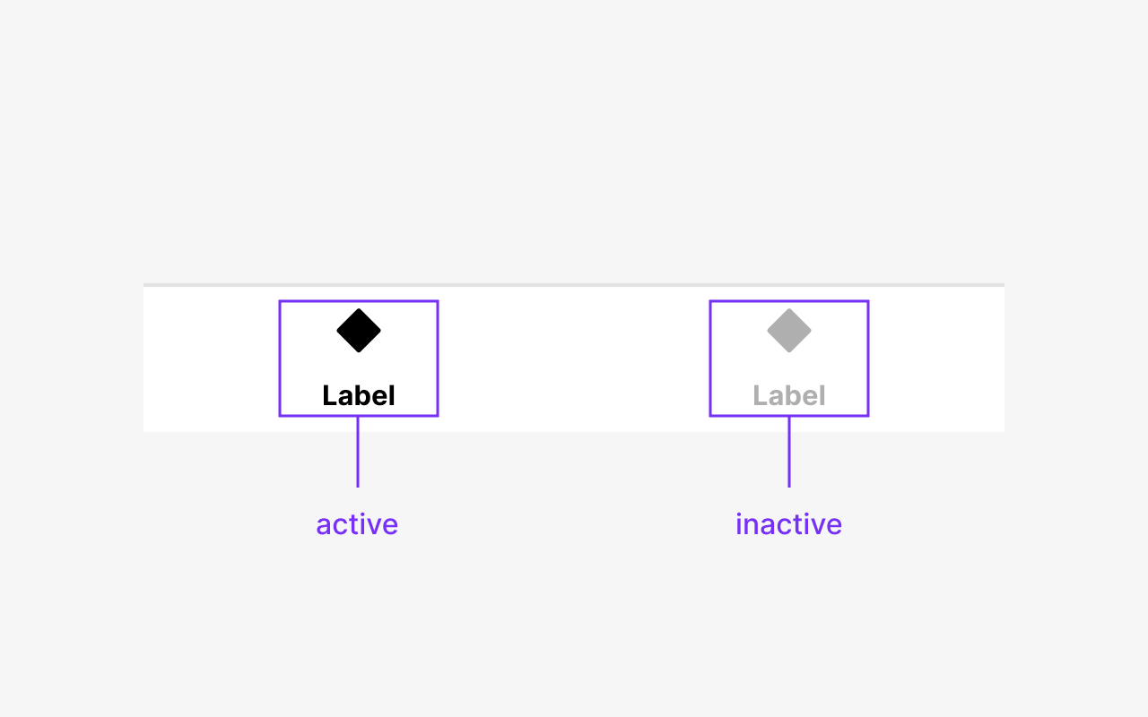
Image 7.1 : Active and inactive State
The active state is always highlighted in color. The inactive state is always displayed in a dim color.
8. Wrapping and truncation
Navigation labels will be truncated when there's not enough space available. Keep your labels as short and as concise as possible. Also, be aware that labels might get longer than expected in different localizations.
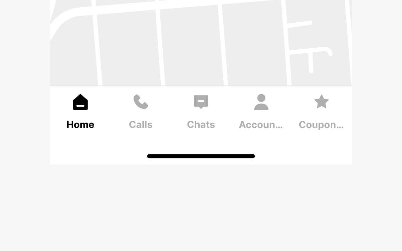
Image 8.1 : Text properties
The text will be dotted out as soon as it is too long.
9. Breakpoints
Base components are optimized for multiple screen widths. There are 2 variants of the Navigation bottom component: Normal and Wide.
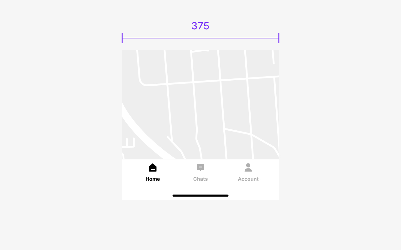
Image 9.1 : Mobile view
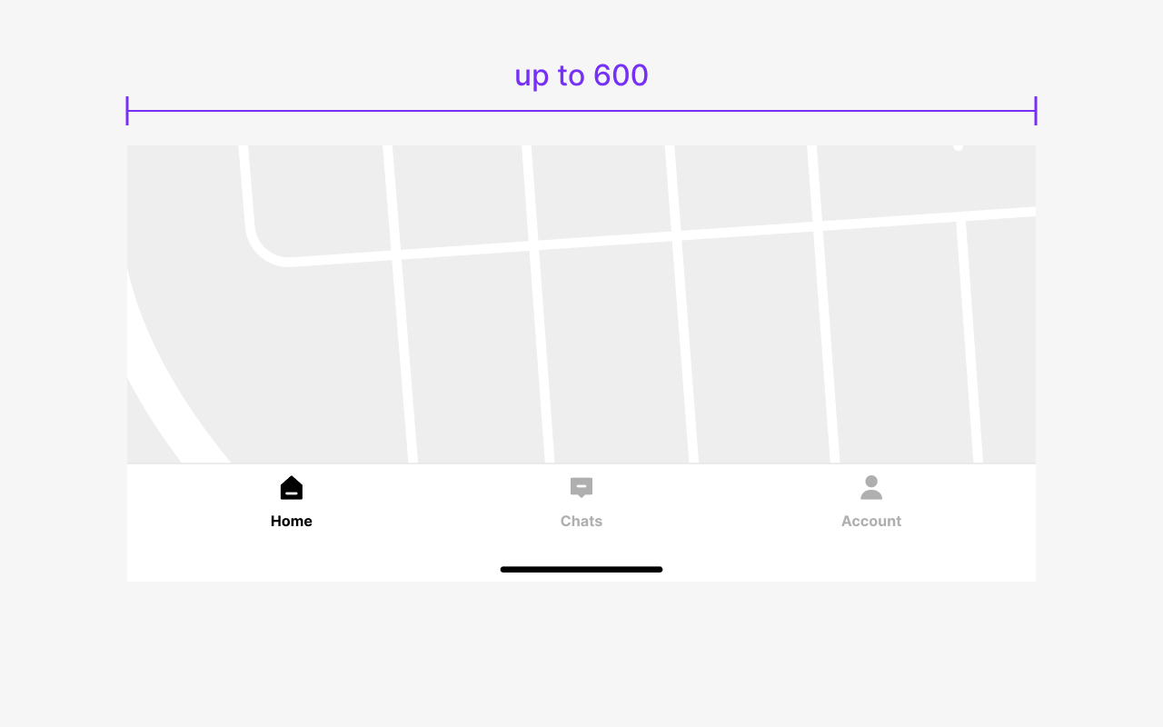
Image 9.2 : Tablet view
10. Metrics
Bottom Navigation tabs are an equal width and take the full width of the screen.
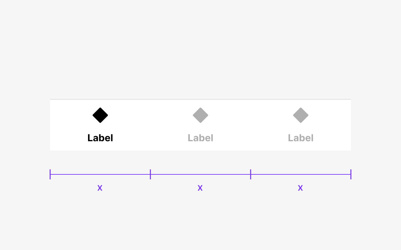
Image 10.1 : Equal width
Bottom Navigation tabs are an equal width and take the full width of the screen.
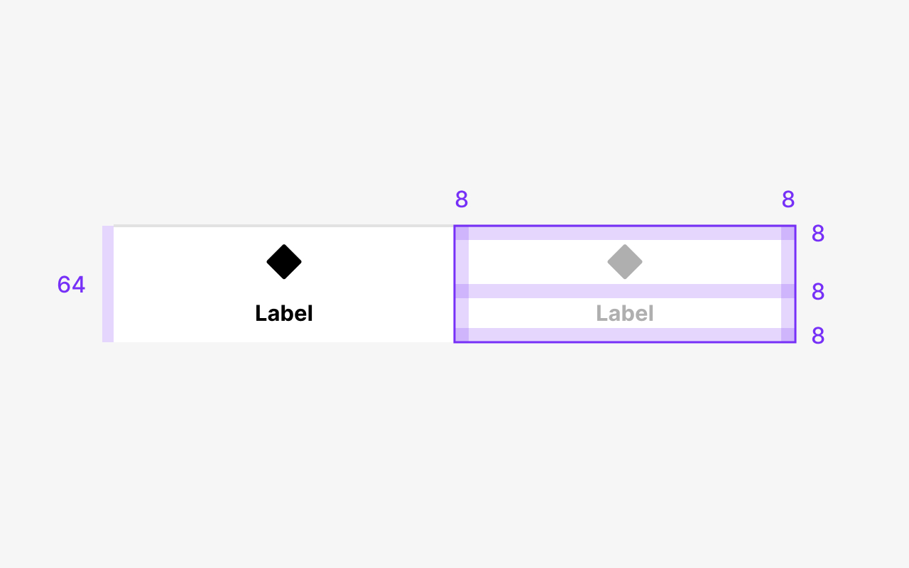
Image 10.2 : Space between
Bottom Navigation tabs have spaces between each other.
11. Type and color
A list of the properties of the Bottom Navigation.
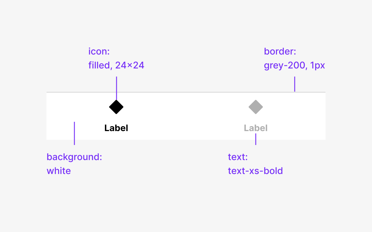
Image 11.1 : Properties
A list of the properties of the Bottom Navigation.
Discover more content
You have questions or need help?
You want to try?
Save time and money?