Top Navigation
You can edit 8 Components for free. Get premium for unlimited access.
The Top Navigation is a top-anchored component that establishes the context of the screen and allows users to easily navigate through different flows.
Figma
The Top Navigation is a customizable component that can be used to display page titles. It serves as an orientation and can contain important functions.
1. Reference
This component inherits props from the Top Navigation.
2. Type
You can edit the type with the md or lg parameter.

Image 2.1 : Type md
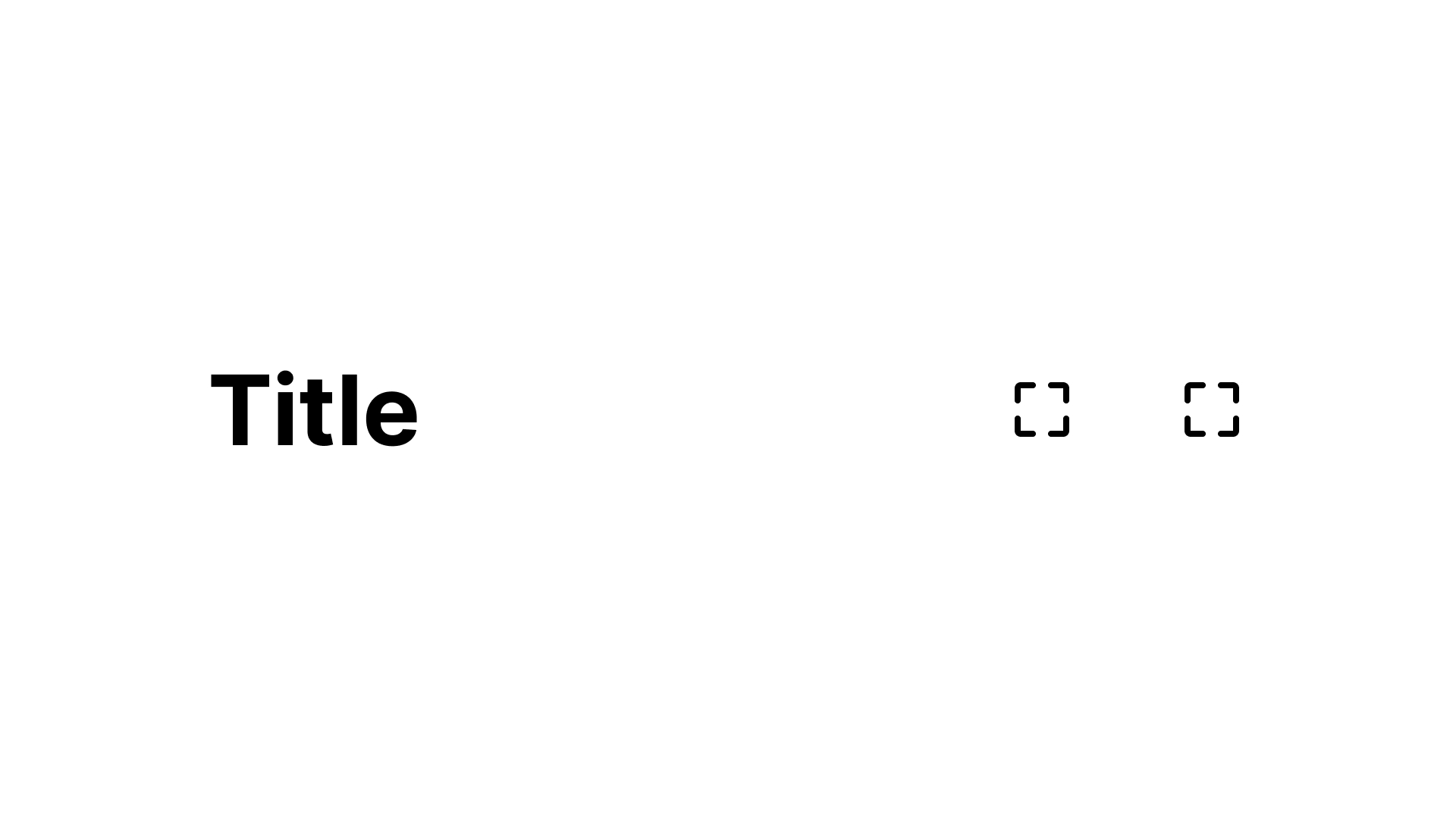
Image 2.2 : Type lg
3. iconLeft
You can edit the iconLeft with the true or false parameter.
Image 3.1 : iconLeft false
Image 3.2 : iconLeft true
4. iconRight
You can edit the iconRight with the true or false parameter.
Image 4.1 : iconRight false
Image 4.2 : iconRight true
Jetpack Compose
The TopNavigation is a customizable component that can be used to display page titles. It serves as an orientation and can contain important functions.
1. Reference
This component inherits props from the Top Navigation.
-
-
-
-
-
-
-
2. Size
You can edit the size with the TopNavigationSize.md or TopNavigationSize.lg parameter.
title = "Title",
size = TopNavigationSize.lg,
iconLeft = TopNavigationIconType.Drawable(
drawable = R.drawable.ic_placeholder,
iconLeftAction = {}),
iconRight = TopNavigationIconType.Drawable(
drawable = R.drawable.ic_placeholder,
iconRightAction = {})
)
Preview
Preview
Code
DlTopNavigation(
  title: 'Title',
  iconLeft: DlPlaceholderIcon(),
  iconRight: DlPlaceholderIcon(),
)Usage
Add this code example to your project to see how the component works.
DlTopNavigation(
  title: 'Title',
  size: DlTopNavigationSize.md,
  showSeparator: true,
  iconLeft: DlPlaceholderIcon(),
  iconRight: DlPlaceholderIcon(),
  onIconLeftTap: () {
    // handle left action
  },
  onIconRightTap: () {
    // handle right action
  },
)API Reference
DlTopNavigation is a top navigation header with optional separator, configurable md and lg layouts, a customizable single-line title, and always-present clickable action slots with optional replaceable icons.
Examples
Variants
Preview
Code
DlTopNavigation(
  title: 'Large navigation title',
  size: DlTopNavigationSize.lg,
  showSeparator: false,
  iconLeft: DlPlaceholderIcon(),
  iconRight: DlPlaceholderIcon(),
)Discover more content
You have questions or need help?
You want to try?
Save time and money?