Joshua Kranefeld
UX Engineer
In this blog you will find lots of useful tips, tricks and explanations that will help you become a better designer & developer
Discover more content
You want to try?
Save time?
You need help?
Optimize your workflow with Modes
You can edit 8 Components for free. Get premium for unlimited access.
With this strategy, you not only save time, but also project budget when working for clients, and bring structure to your new, optimized way of working.
1. Status Quo
Most designers create different versions for the various requirements of a screen. This quickly leads to the file becoming very large and unwieldy. Furthermore, this technique is very error-prone, which is far from ideal.
1.1 Different Screens for iOS and Android
Traditionally, one starts by designing either an iOS or Android app. Later, an exact copy of these screens is created for the other operating system.
1.2 Different Screens for different Breakpoints
Even when developing apps, you have to consider various breakpoints right from the start. Most apps work not only on smartphones but also on tablets.
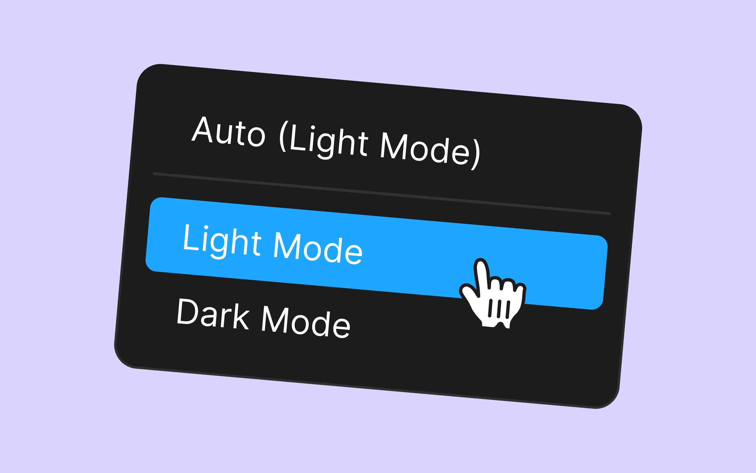
1.3 Different Screens for Light and Dark Mode
To offer users a choice between light and dark mode, a complete copy of the app in the other mode is usually created as well. This doubles the number of screens.

Image 1: Different Screens for all different modes and sizes
2. Design for different Breakpoints at one Time
If you use the integrated modes in Dynamic Layer, in the future you will only need to design for one breakpoint and the other will be directly translated to the other size.
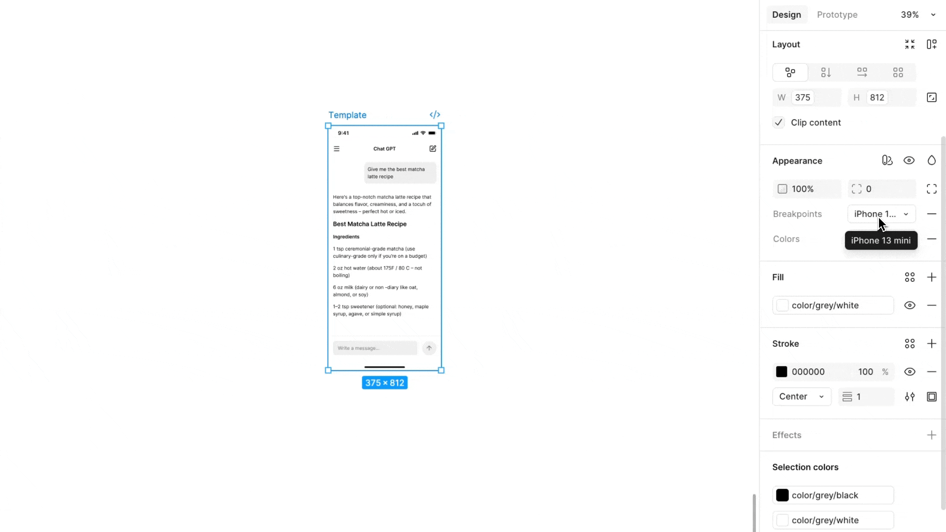
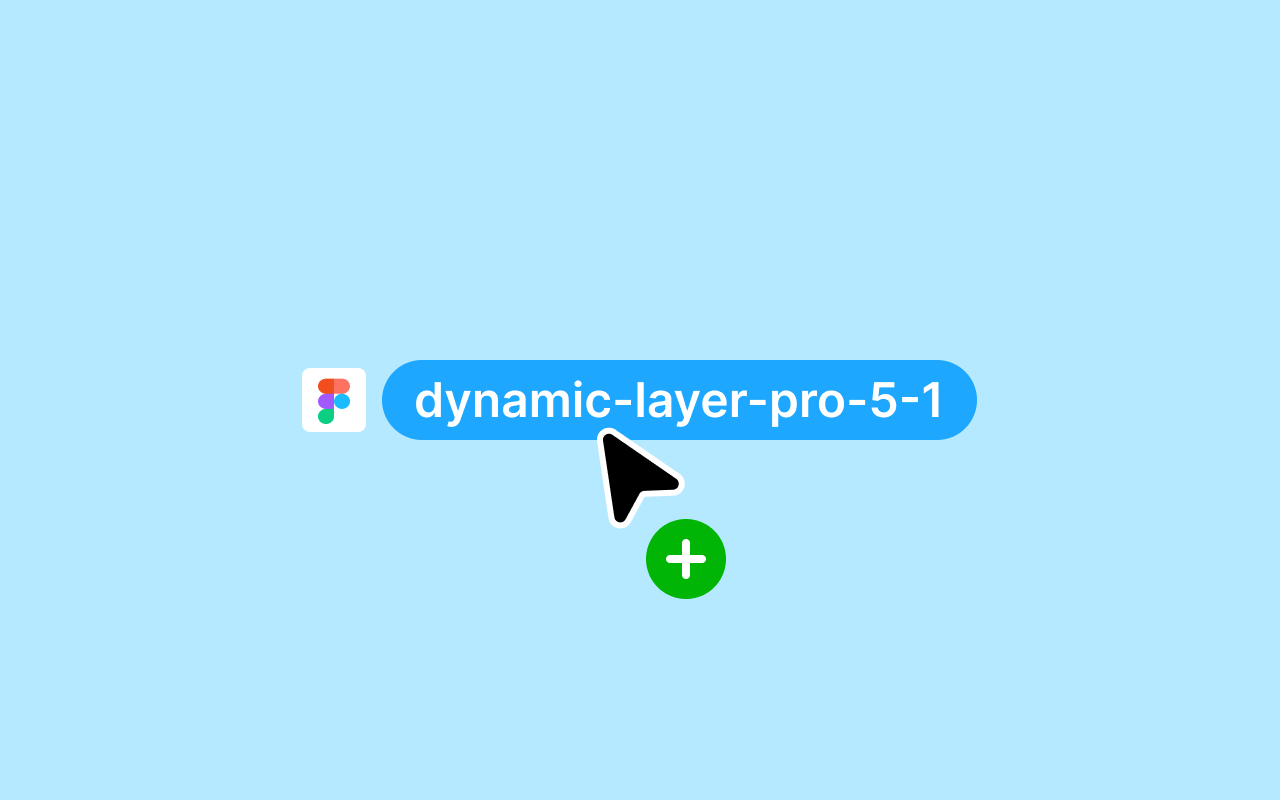
Image 2: Switch between Smartphone and Tablet with one click
2. Design for Light and Dark Mode at one Time
If you use the integrated colors from the Dynamic Layer System, all colors are already correctly defined for light and dark mode. This means you can switch between the different modes with just one click.
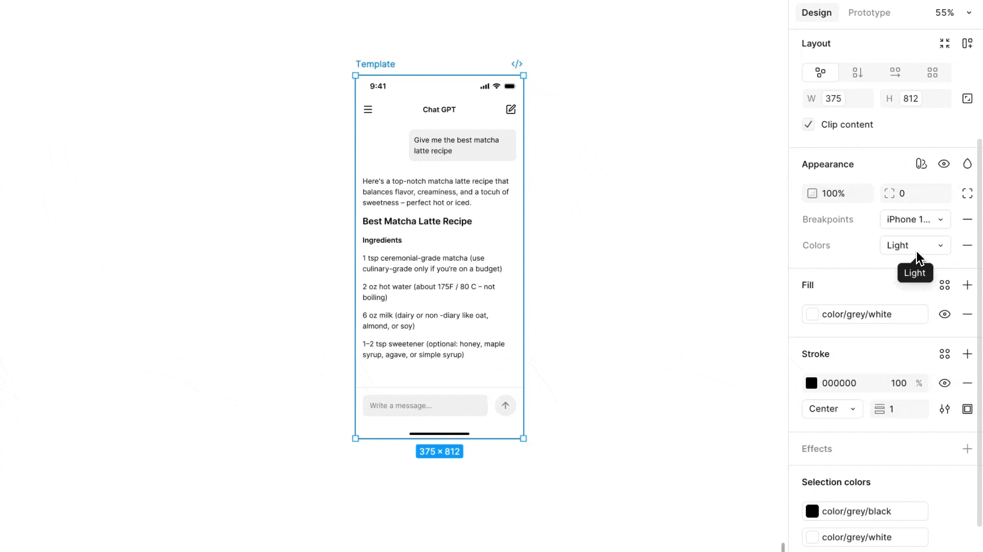
Image 3: Switch between Light and Dark Mode with one click
3. Design for iOS and Android at one Time
Something often forgotten when designing mobile apps is that there are two different operating systems that need to be considered. This is already factored into Dynamic Layer's design system and works with just one click.
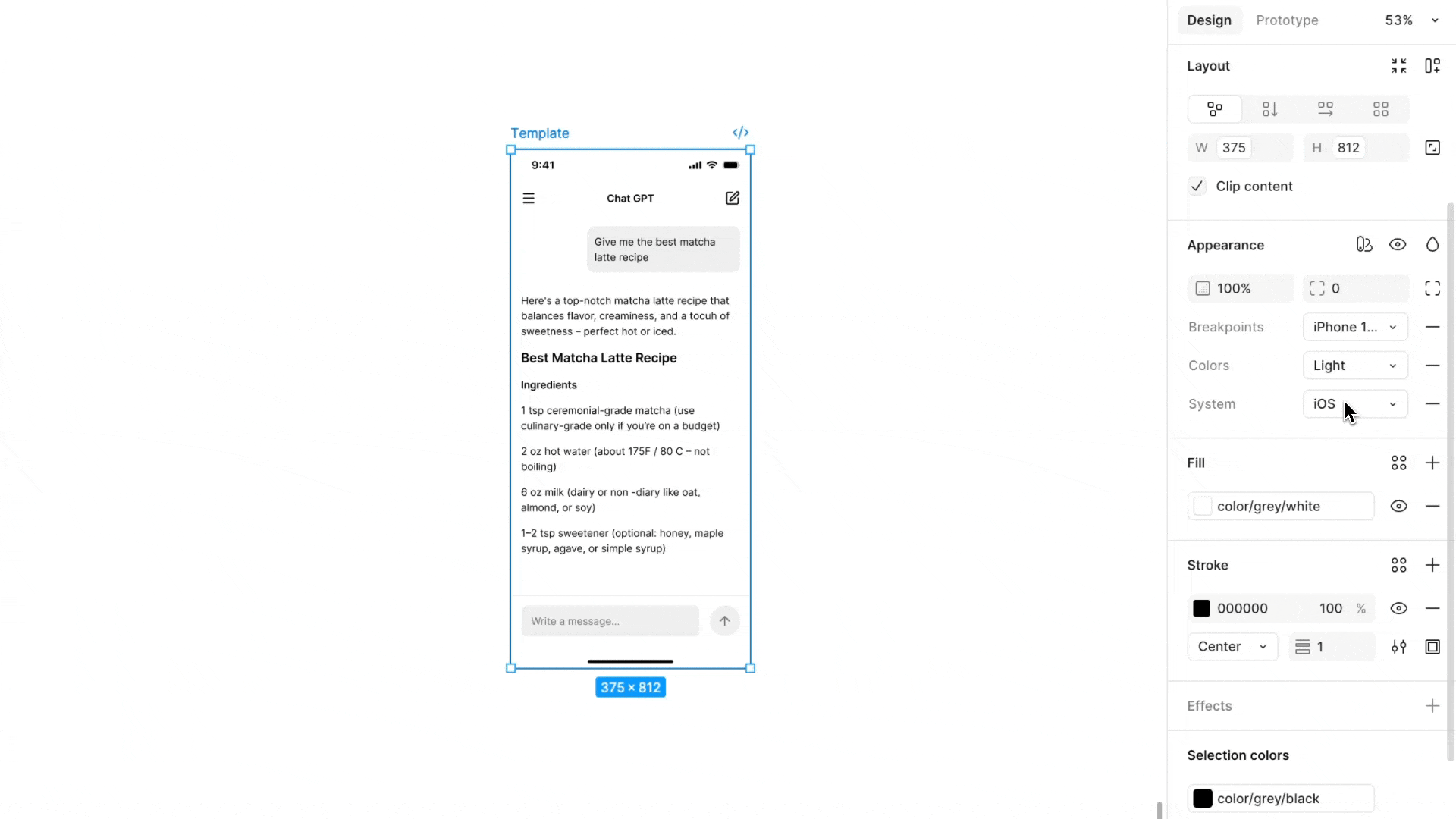
Image 4: Switch between iOS and Android with one click
Similar articles
Discover more content
You have questions or need help?
You want to try?
Save time and money?